You have a great product. Your services are top-notch. But your website feels like a digital maze. If your visitors have to “think” about where to click next, you’ve already lost them. In the world of web design, clarity is king, and simplicity is the ultimate sophistication.
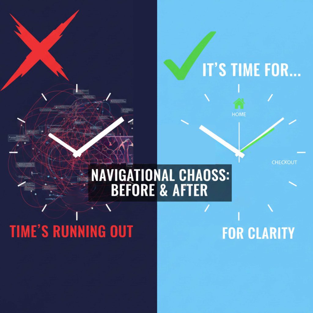
The Mistake: many businesses fall into the trap of “Over-designing.” They add too many menu items, hidden hamburger menus on desktops, or flashy animations that obscure the actual path to purchase.
Why It’s Costing You:
- High Bounce Rates: Frustrated users leave within seconds.
- Reduced Trust: A chaotic site looks unprofessional.
- Lost Revenue: If they can’t find the “Buy” button, they can’t spend money.
The WebDesignTime Solution: We believe in Intuitive Flow. We map out the user journey before we even touch the visuals. Every click should feel natural, every page should have a clear goal, and the path from “Landing” to “Conversion” should be a straight line.
Conclusion: Don’t let a messy menu ruin your business growth. It’s time for a layout that leads to results.